6 Ways You Can Use Your Brand Photos On Your Website
You when you rock your brand photoshoot, only to realize that you actually have to do something with all of these awesome images:
Here you are! You just got home from your brand photoshoot and you're on a high thinking about all of the wonderful ways in which you can use these photos:
On Instagram!
Your new LinkedIn profile pic!
OMG! You can finally update your email signature!
But you're forgetting one...
There's one key area in which your brand photos are going to make the most impact on your business: your website.
HIGH-QUALITY BRAND PHOTOS ON YOUR WEBSITE CONTRIBUTE TO WARMER LEADS, QUICKER CONVERSIONS, AND DEEPER CONNECTIONS WITH YOUR TARGET AUDIENCE.
Here are 6+ places you can use your brand photos on your website!
1. YOUR HOMEPAGE HERO IMAGE (DUH)
Obvious, right? Of course, it is!
Beyond being the first image your visitors will see and process, your homepage hero image makes up their entire first impression of your business.
It's a BIG deal — and you should probably put some serious thought into what sort of impression you want to give your first-timers!
You obviously want them to know exactly what it is that you do. But maybe you want to show off your unique angle or specialty. Or your funky personality and refined aesthetic!
The best homepage hero images are able to do all of this and more by telling a story. You might, for example, use a photo of you in your environment doing your work as your homepage hero image to really sell your story.
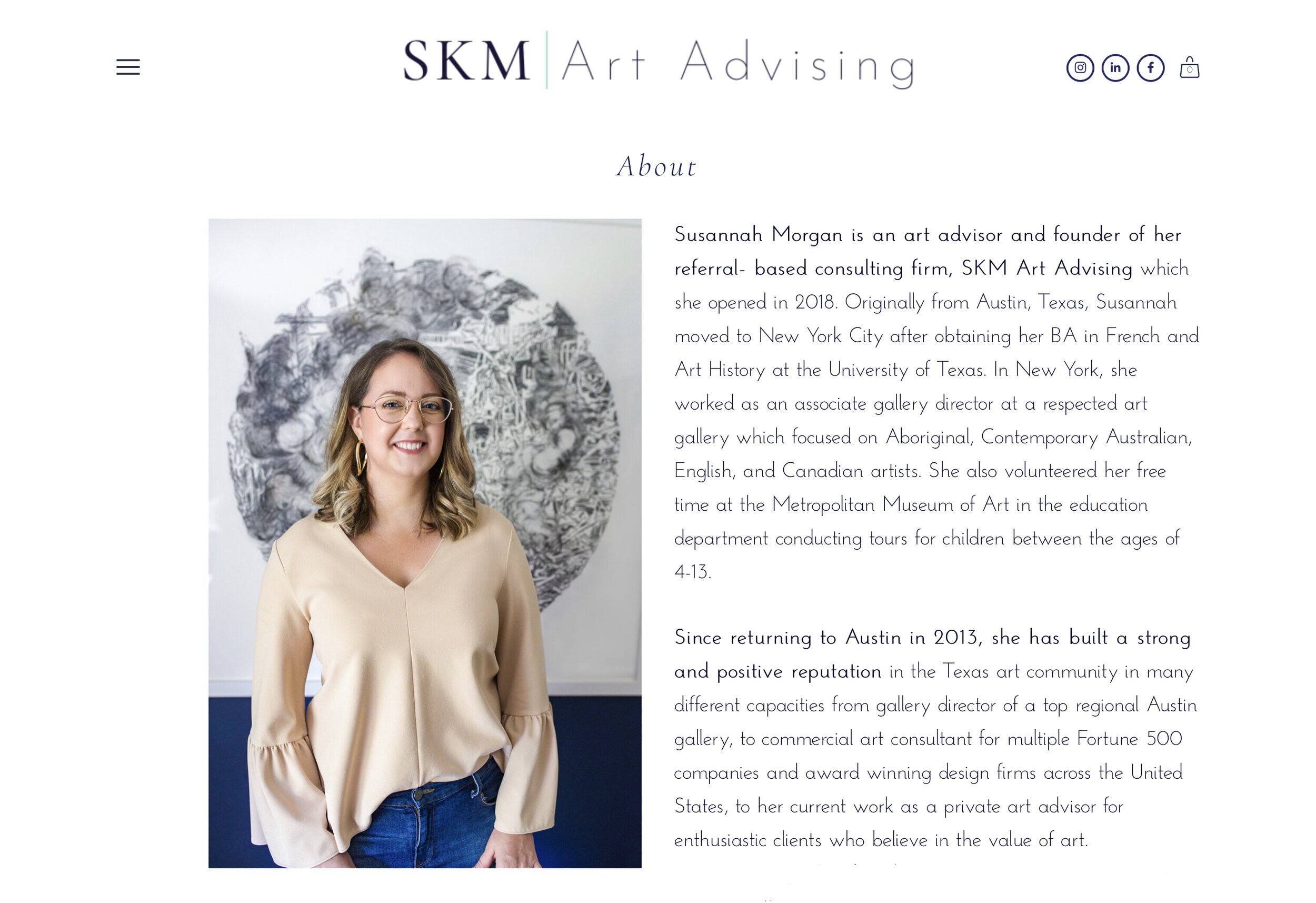
2. YOUR ABOUT PAGE, WITH INTENTION
We don't mean to sound redundant, but there's a good reason we're calling out the obvious ones first!
Of course, you want to update your home page and about page with your brand new brand photos — but have you ever thought about why? And how to make the most out of these high-traffic pages?
Let's think about the purpose of an about page. On one level, it's a place to share your journey, show off your credentials, and inject a little personality into your site.
But it should also be the place where you are able to connect most with your target audience by showing empathy for their struggles and then offering up your impactful solution.
Because your about page is a place for personal connection, the brand photos you showcase here should actually try to encourage personal connection.
Try to include a collection of personality-filled, story-driven photos on your about page. Ones that show you in action, radiate your energy and tell your one-of-a-kind story.
Bonus points if you can dig up some "historical" photos from your past that line up with your brand story! (This doesn't have to do with your brand photos, but we felt like it was too good of a tip to skip!)
3. YOUR SERVICES/OFFERINGS PAGE
Believe it or not, some of us forget to include photos of OURSELVES on our services pages! (Previously guilty!🙋🏾♂️🙋🏻♀️)
That's because it feels a little bit counteractive on a services page. You're there to sell your services or products, right? Not to sell yourself.
Wrong!
People don't buy from you because of your services, they buy from you because they love YOU. Your brand! Your personality!
So let that brand shine through in the place where it matters most!
The most authentically feeling way to do so is to provide a few more "action shots" for your audience. These action shots are so powerful because they enable your audience to imagine you at work on their project, and then them enjoying the results down the road!
Imagination is a powerful tool, y'all! It's better to help your audience imagine the good things than to leave it up to them to decide what you are like.
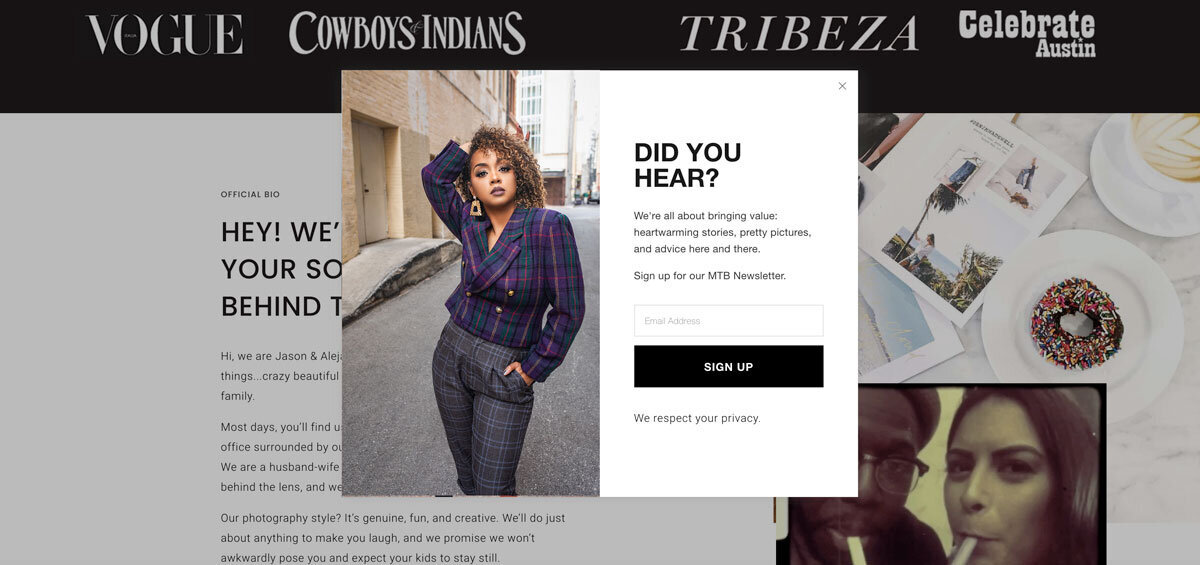
4. YOUR NEWSLETTER OR FREEBIE SIGN-UP CALL TO ACTION
Are those little pop-ups annoying sometimes? YES.
But do they work? Yes!
The very best way to be salesy without coming off salesy, is to inject your authentic personality into everything you do — including promotion!
Be it a freebie or a newsletter sign-up, using your brand photos as a means of visual representation can help drive connection and establish trust within your audience.
They are, after all, handing over their personal information. The least you can do is make them feel like you're going to do good things with that information. (Because you are!)
5. YOUR BLOG & BLOG POSTS
A teaching moment within a teaching moment about teaching moments! #Teachception
Here's your teaching moment (that's the last time we'll say it. We promise): Just because it's educational, authoritative, and all-around intriguing doesn't mean there isn't space for fun and personality.
In fact, your blog posts are the perfect place to showcase your brand photos!
Brand photos are incredibly powerful trust-building tools and are instrumental in helping your audience make that final connection (and hopefully, that final 💰 move).
Use them in your blog preview image, as a promotional mockup graphic of your blog, a Pinterest promo image, or a means of demonstrating the topic at hand.
6. YOUR CONTACT PAGE
Sensing a common theme here?
Trust. It's important. And there are few places it's more important to establish than your contact page — one of the final steps in a viewer's buying journey!
Take this final opportunity to show your audience who they're going to be working with. Make that connection. Then you can make that sale!
BONUS!
Ever downloaded a press kit, services guide, or freebie from someone's site?
Isn't it nice when those downloads really match the branding and feeling you get from their website? You're right, it is nice!
These downloadables may not be one with your website, but they're still a part of the experience! Whenever you update your brand photos, be sure to take some time to update your downloadables too!
DOUBLE BONUS!
Your Google My Business listing, CRM platform, and online membership portals are all extensions of your website and a huge part of your client's onboarding experience.
Think about it: your almost client searches for you on Google and comes across your Google Reviews. There, they gain some deeper insight into what it's going to be like to work with you while getting a feel for your personality through your brand photos.
Once they are ready to commit, they head over to your contact page and fill out the embedded Dubsado form. Once they're in your CRM, they'll start receiving communications from you regarding your next steps.
Their entire perception of your brand and satisfaction with the end result relies heavily on these initial interactions with you (or your automated emails).
Every time you update your brand photos, you should also try to update other brand touchpoints to keep things cohesive and current.
While we're on the topic of keeping things updated… when was the last time you updated the look and feel of your Squarespace website? With those shiny new brand photos on the way, this might be the perfect time to give things a little ✨refresh✨.
Our besties over at Squaremuse want to help out!
We're partnering with Squaremuse to provide you with an exclusive discount on your next Squarespace template! Click THIS LINK to take advantage of this epic opportunity.
We use the Lyra template from Squaremuse for our website and... well, LOOK AT THE OL' BEAUTY! We couldn't be happier with the outcome!
Until next time, friends!
— Jason and Alejandra Bryant
Need new brand photos for your website?
WE CAN HELP WITH THAT!
If you liked this post, Pin it to Pinterest! 👇🏽


